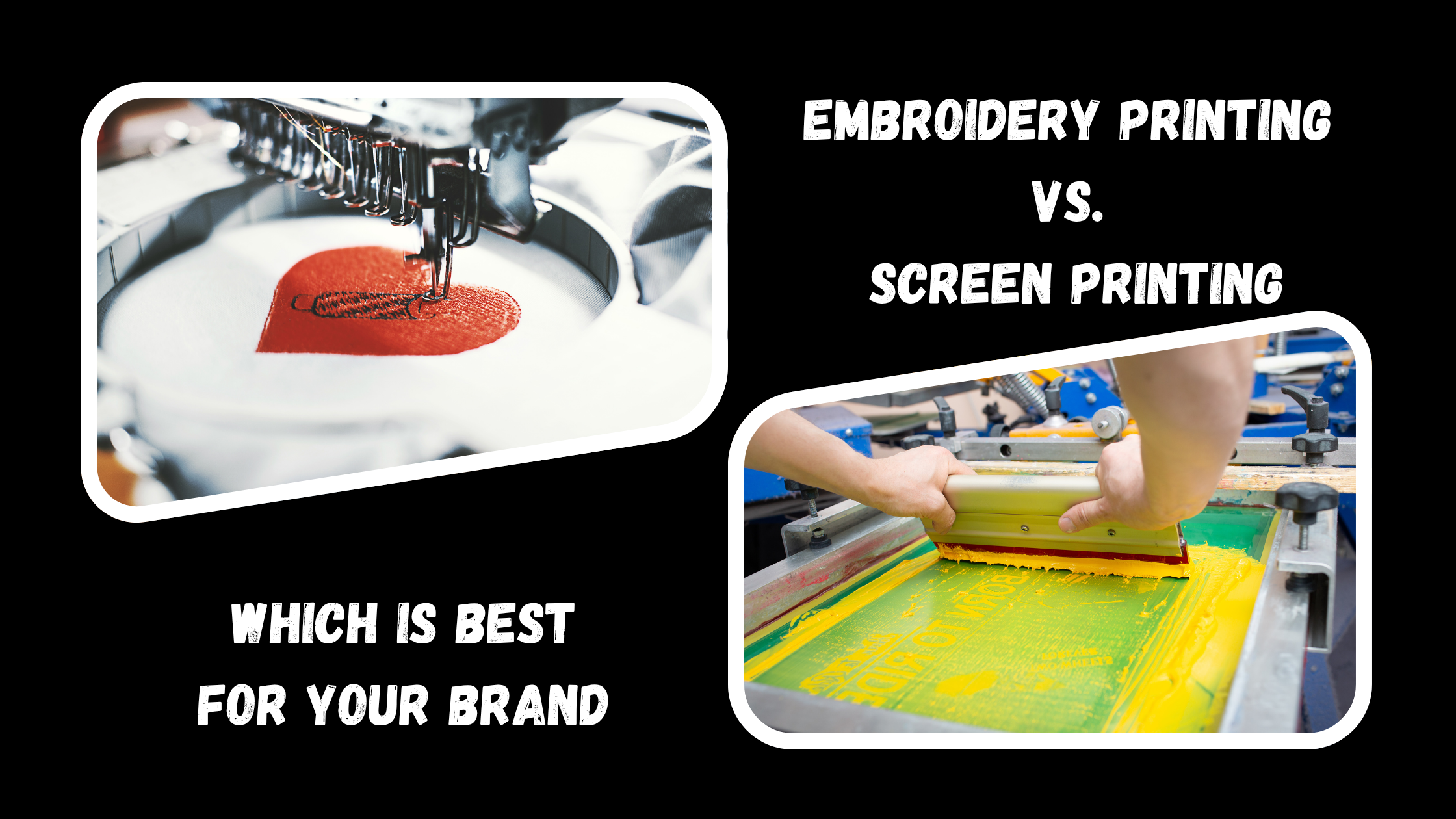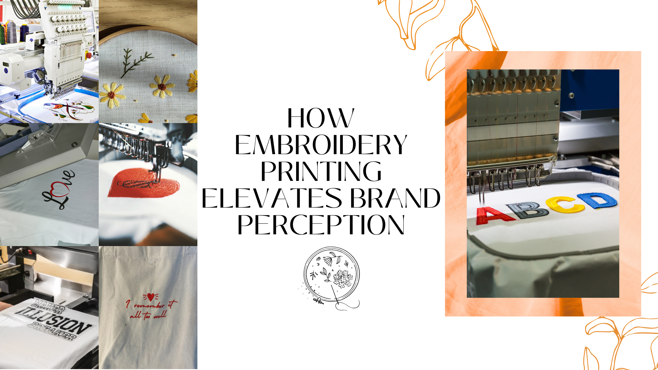

Introduction
Embroidery has always been more than decoration — it’s a statement of craftsmanship and brand identity. When done well, an embroidered logo on a shirt, hat, or jacket communicates quality and attention to detail. But before that design becomes a perfectly stitched masterpiece, it needs one crucial step — artwork preparation.
At TeePrints.in, we often meet clients who come with beautiful digital designs that simply don’t translate well to thread. The reason isn’t creativity — it’s preparation. Embroidery machines interpret art differently than printers do, so the artwork must be structured specifically for stitching.
This blog walks you through how to prepare artwork for embroidery step by step — ensuring clean lines, perfect colors, and professional results every time. Whether you’re a designer, marketer, or business owner, this checklist will help you achieve embroidery perfection.
1. Start with a Clean, Vector-Based Design
Embroidery machines work best with precise, well-defined artwork. That’s why it’s important to begin with a vector file — formats like AI, EPS, or SVG — instead of a raster file like JPG or PNG.
Vector designs maintain sharp edges, scalable shapes, and clean lines regardless of size. They eliminate pixelation, which helps the embroidery digitizer convert every element into smooth, stitchable paths.
When preparing your design, simplify shapes and remove unnecessary gradients or shadows. Keep in mind that embroidery doesn’t reproduce fine fades or pixel details well. Solid, bold shapes are always more effective.
By starting with a vector file, you give the machine a clear, predictable pattern to follow — reducing errors and improving the final stitch quality.
2. Keep It Simple — Less Is Always More
When it comes to embroidery, simplicity wins every time. Unlike digital printing, embroidery has physical limitations. The thread can only handle so much detail before small elements begin to blur or distort.
Designs that look perfect on a screen can become messy when stitched on fabric. Thin lines, tiny icons, or small text often lose clarity. For example, a delicate swirl in a logo might appear as a solid blob once stitched.
The rule of thumb? Bold, clean, and minimal. Avoid thin lines under 1 mm and tiny text smaller than 5 mm in height. Focus on clear, strong elements that can withstand thread tension and needle movement.
Simple designs not only stitch better but also look more professional and stand out more from a distance — especially for uniforms, promotional wear, or caps.
3. Choose the Right Fonts and Sizes
Typography can elevate or ruin an embroidered design. Fonts that are too thin, intricate, or decorative can be difficult for machines to render. Script fonts often result in overlapping or broken stitches.
To ensure legibility, use sans-serif fonts such as Arial, Lato, or Montserrat. These offer clean lines that stitch beautifully. The smallest readable letter height in embroidery is typically around 0.25 inches (about 6mm). Anything smaller may lose clarity.
If your design includes fine or cursive text, consider enlarging that portion or converting it into a block font. When in doubt, test a single sample. Every fabric behaves differently, and a test run ensures your text remains readable and sharp.
4. Pick Colors with Purpose
Unlike printing, embroidery thread doesn’t rely on ink mixing or gradients. Each color is represented by a specific thread spool, which gives the design a rich texture and sheen.
Before finalizing your artwork, select thread colors intentionally. Fewer colors usually mean a cleaner, more cohesive result. Also, keep in mind that thread reflects light — so your chosen shade might look slightly different under natural or studio lighting.
When designing, match your brand’s Pantone colors with the nearest available thread shades. For dark garments, use contrasting thread colors so the design pops. A white thread on navy fabric, for instance, always delivers a crisp, elegant finish.
By planning your color palette early, you’ll avoid last-minute surprises and ensure brand consistency across all embroidered items.
5. Understand the Fabric You’re Working On
Fabric choice affects how embroidery looks and performs. A design that stitches beautifully on cotton may behave completely differently on polyester or denim. Each material has its own texture, thickness, and stretch — and your artwork needs to adapt to that.
For instance, cotton and twill fabrics handle dense stitch patterns well, producing crisp lines and defined edges. In contrast, stretchy fabrics like spandex or jersey may require looser stitch density to prevent puckering. Thicker materials, such as denim or canvas, often need stronger stabilizers and adjusted tension to avoid distortion.
If you’re unsure, talk to your embroidery provider (like TeePrints). A professional team can recommend the ideal backing, thread, and stitch density for your chosen garment.
6. Digitize the Design Properly
Digitizing is the bridge between design and embroidery. It’s the process of converting your vector file into a stitch file that machines can interpret. This is not a simple “save as” operation — it requires specialized skill and software.
A professional digitizer decides how the design should stitch: the direction of each stitch, the density, and the layering order. They also set underlay stitches (the base structure) to stabilize the fabric and prevent warping.
Good digitizing ensures the final embroidery mirrors your original design as closely as possible. Poor digitizing, on the other hand, can lead to gaps, uneven fills, or thread breaks.
7. Always Test Before Full Production
Even the most carefully prepared artwork deserves a test run. A sample stitch reveals potential issues before they become costly mistakes in a bulk order.
Testing allows you to check alignment, thread tension, density, and color contrast on the actual fabric. It also gives you a chance to confirm that the design’s size and placement look exactly as intended.
Skipping this step can lead to inconsistencies across pieces or wasted materials.
8. Plan Placement and Hooping Carefully
Placement matters as much as design. A logo that’s just a few millimeters off-center can look unprofessional, especially on uniforms or caps. Before stitching begins, confirm the exact location, orientation, and size of your artwork.
Different garments require different hooping techniques. For example, a left-chest logo on a polo must be positioned at a consistent distance from the sleeve seam. Sleeve or cap designs need curved hooping setups to maintain balance and tension.
Provide your embroidery team with clear placement guides or mockups. Precise alignment helps maintain brand consistency across large orders — especially when dressing entire teams or staff members.
9. Use Quality Threads and Needles
The quality of your materials directly affects the outcome. Low-quality threads can fray, fade, or break easily, leading to uneven stitching and rough textures.
Polyester threads are known for their durability and colorfastness, making them perfect for uniforms and workwear. Rayon threads offer a beautiful glossy finish for more decorative pieces, while metallic threads add luxury — though they require slower machine speeds and expert handling.
Pair these threads with sharp, well-maintained needles that suit the fabric type. For example, ballpoint needles work better for knits, while sharp-point needles are ideal for woven materials. The right combination results in smooth stitching and long-lasting designs.
10. Inspect and Finish with Care
The final stage is quality inspection. Every embroidered piece should be checked for accuracy and neatness before delivery.
Look closely at color consistency, edge clarity, and thread trimming. Ensure there are no loose threads, skipped stitches, or fabric puckers. Proper finishing — including trimming and pressing — gives your embroidery a polished, professional look.
This attention to detail may seem small, but it reflects your brand’s commitment to quality craftsmanship. At TeePrints, we treat every item as a representation of our client’s brand image — because it is.
Bonus Insight: Combine Printing and Embroidery for a Modern Edge
Modern branding doesn’t have to choose between techniques. Mixing DTF Printing or Screen Printing with Embroidery Printing can create eye-catching textures and hybrid effects. For example, a printed background with embroidered highlights gives dimension and luxury to any design.
This approach is becoming popular among lifestyle brands and corporate clients who want something beyond standard logo placement. It’s creative, cost-effective, and memorable.
Conclusion
Preparing artwork for embroidery is both a technical and creative process. From cleaning up your vector file to choosing the right fabric, every step contributes to the final masterpiece. Rushing or skipping any of these steps often leads to disappointing results — while careful preparation ensures that every stitch adds to your story.
At TeePrints, we help brands, designers, and businesses transform digital ideas into tangible works of art. Whether it’s custom uniforms, personalized gifts, or promotional merchandise, we make sure every thread speaks of precision and professionalism.
Embroidery may seem simple, but the secret to stunning results lies in the details. Follow this checklist, collaborate with experts, and watch your design come to life — one stitch at a time.